Problem The existing identity spoke to an older generation of the studio and no longer represented our youthful mindset or distinctive design perspective.
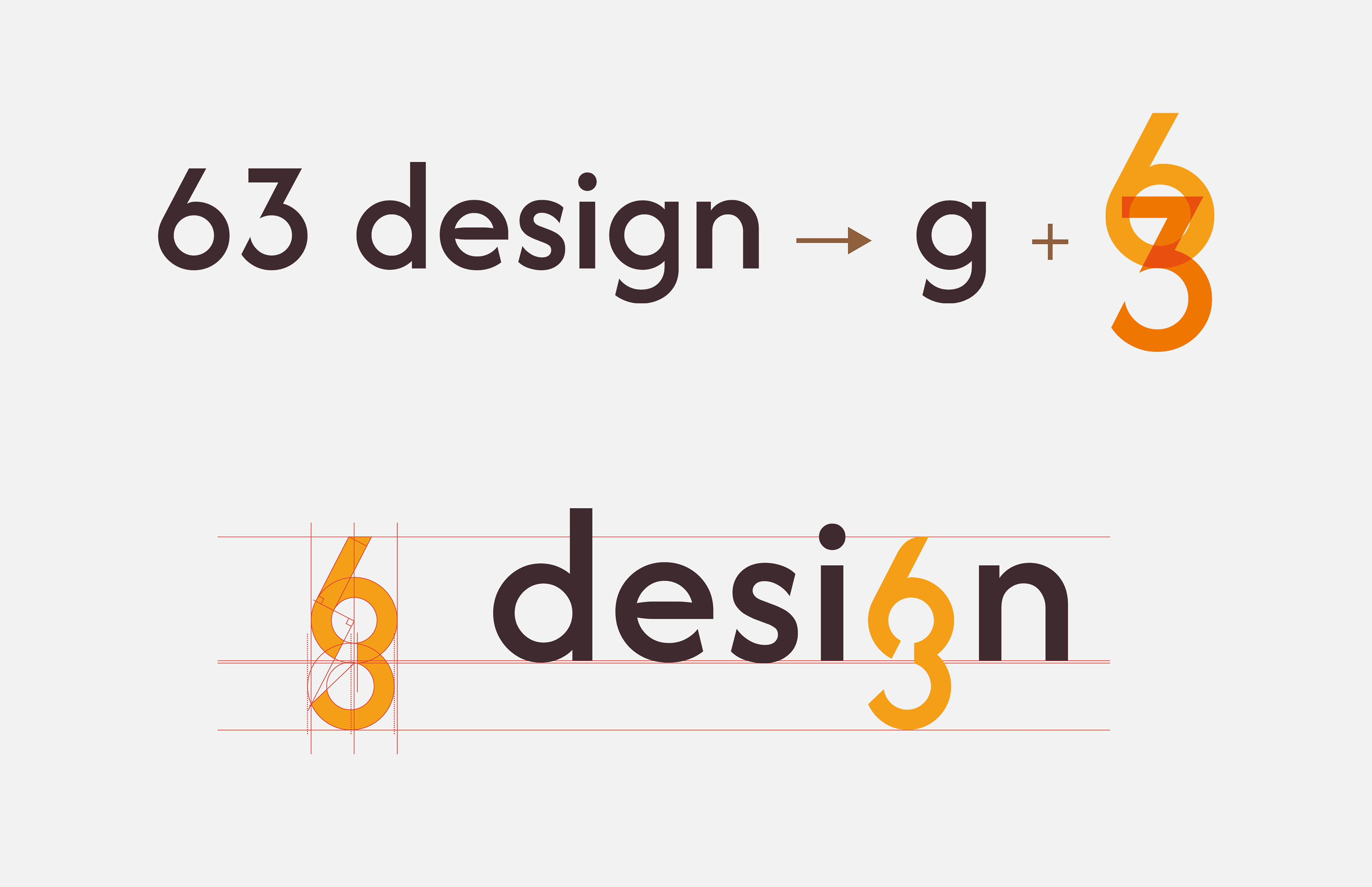
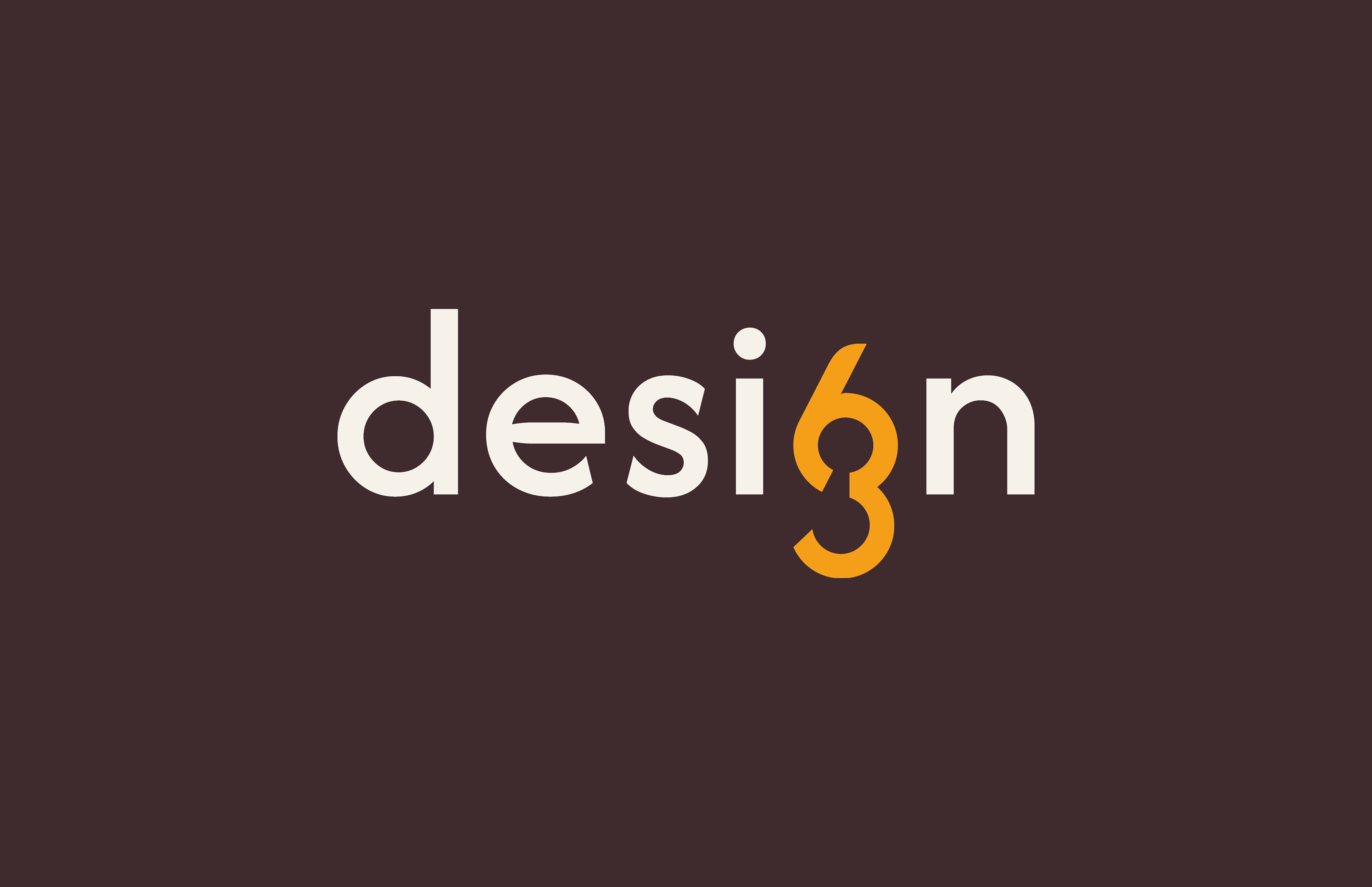
Creative Thought Process (1) Reframe the numbers 6 and 3 as a single visual system rather than static characters (2) Explore modular, 3D cube constructions, patterns to generate flexible iconography --abandon this idea-- (3) Simplify and iterate until the 6 and 3 could merge seamlessly into one functional mark
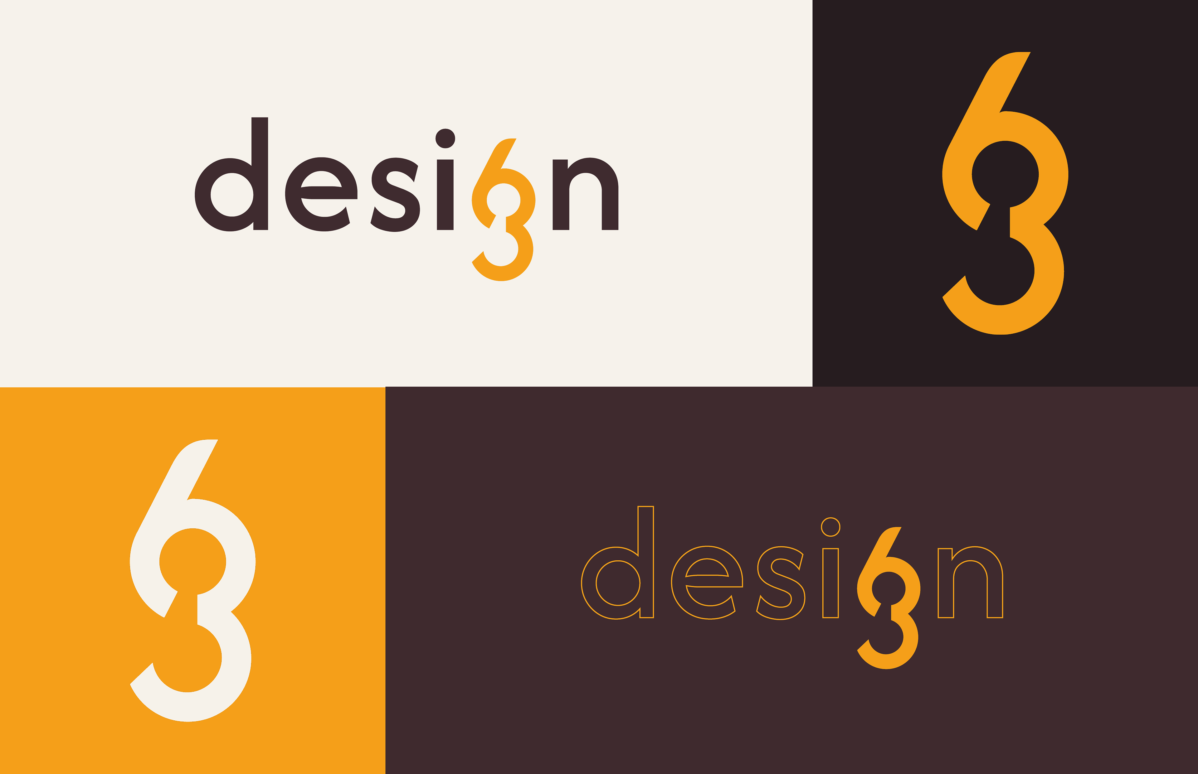
Result A custom logo-mark where the integrated 63 replaces the “g” in design, becoming the core of the brand identity. A refined palette of off-blacks and off-whites, reflecting our print-first philosophy where color is never purely digital. A unique, simple, web presence that showcases the new identity our works, history and beliefs.
Team 63DE-SIGN SRLs
Check out the live site: 63de-sign.com